
710 content works when it shows texture, ritual, and intent
Useful 710 wax and concentrate content should move beyond generic product shots and build a visual system around texture, use moment, and buyer context. Concentrate shoppers are looking for proof. They want to see consistency, color, cleanliness, packaging logic, and how a product fits into a real session. They also want the content to feel premium, because the category itself is premium. Strong concentrate creative can sit between education, design, and appetite appeal. It is not enough to say a jar is fire. You need to show the consumer what makes it worth opening, saving, sharing, and asking for again. At High Rise, we think 710 content should make the product easier to understand and easier to remember, not just easier to scroll past.
Why the stakes are higher in concentrates than in flower
Concentrates are a detail category. Small differences matter more here than they do in many other parts of cannabis. A flower post can sometimes succeed on mood, lifestyle, or packaging alone. Wax, badder, rosin, and live resin usually cannot. The audience notices whether the texture looks dry, greasy, whipped, glassy, or unstable. They pay attention to jar presentation, dab tool styling, cleanliness of the macro, and whether the visual language matches the price point. When brands miss those details, the result is not neutral. It can quietly undermine trust.
That matters because concentrate buyers are often loyal, informed, and highly comparative. They may already know the difference between solventless and hydrocarbon. They may compare multiple drops before ever stepping into a shop. If your creative is sloppy, flat, or generic, the audience can read that as a product problem even when the actual extract is strong. That is the business stake. Weak 710 creative does not just create lower engagement. It can make a premium product feel ordinary, which is expensive in a category where differentiation is already hard. The same discipline that improves content creation also protects perceived value.

What the buyer is really trying to learn from a concentrate post
Most teams assume 710 content is mainly about hype. In practice, buyers are trying to answer a more useful set of questions. Does this look clean? Does it feel fresh? Does it seem worth the ticket? Is the brand speaking to experienced consumers or to curious upgraders? Does the package feel designed for this category or copied from somewhere else? Can I picture how this product will fit into my routine?
Good creative reduces that uncertainty. It does not need to explain every technical point in one frame, but it should signal that the brand understands the category. That can come through with macro detail, strain naming hierarchy, tool choice, composition, caption structure, and pacing across the post set. For example, the difference between a beautiful jar shot and a useful concentrate asset is usually context. The useful asset helps the viewer understand the product faster. That same principle is why smart brands connect concentrate storytelling to adjacent channels like owned newsletter distribution, educational landing pages, and a stronger website experience instead of relying on social alone.
A practical framework for 710 content with a defined communication job
1. Lead with the texture story
Texture is the headline. If the viewer cannot immediately read the product surface, consistency, and material quality, the asset is already underperforming. This is where lighting, macro distance, and color separation matter most. The goal is not visual trickery. The goal is honest legibility. Show the folds, pull, whip, sheen, or snap in a way that feels deliberate. Concentrate shoppers reward that clarity.
2. Make the ritual feel elevated, not random
The category is tactile, so the ritual matters. Dab tools, jars, gloves, quartz, surfaces, and negative space all change the message. When those choices feel thrown together, the post can look messy even if the product is excellent. When they feel curated, the brand starts communicating confidence. This is especially useful for brands that want to move upmarket. Your ritual language should make the audience feel that the team behind the product cares about every step after extraction, not just the final shelf shot.
3. Give each asset one job
Trying to make every image do everything usually weakens the full set. One image can prove texture. Another can highlight packaging. Another can create desire through color and composition. Another can show scale or handling. Another can support education in the caption. This is the same planning discipline we use when mapping creative systems for awareness campaigns or landing-page media. Concentrate content gets stronger when each piece has a clear role inside the sequence.
4. Match the visual language to the actual product tier
One of the fastest ways to create disconnect is to sell premium concentrate with bargain-bin creative or, just as badly, to over-style a mid-tier product until the promise feels inflated. The look should match the truth. If the product wins on purity and process, let cleanliness and restraint carry the frame. If it wins on personality and drop energy, let color and pace do more work. High Rise’s point of view is that honesty performs better than overcompensation in cannabis because the buyer base is already skeptical of empty polish.
5. Build the post set as a narrative, not a folder dump
A strong concentrate carousel or campaign does not feel like ten unrelated files. It opens with a clear hook, deepens interest with texture and proof, broadens the brand world with packaging or ritual, then gives the audience a next step. That next step might be a product page, a menu locator, a newsletter signup, or a supporting article in the Newsroom. The content should pull the viewer forward. When the sequence is coherent, later assets can build on context introduced earlier.
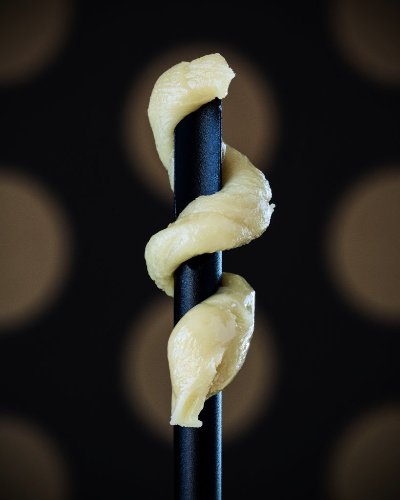
What strong concentrate creative usually shows
In this category, proof comes from disciplined presentation. A well-composed macro makes consistency visible. A clean product-and-tool shot implies process care. Packaging that feels integrated with the extract rather than separate from it helps buyers understand the full brand system. A thoughtful caption can frame the strain, format, or use case without leaning on unsupported promises. Even the decision to avoid visual clutter can be proof of maturity.
We see the strongest concentrate brands repeat these fundamentals across channels. Their social posts align with their menus. Their web presentation supports the same cues the product photography introduces. Their launch materials, partner decks, and editorial features all speak the same language. That is why we often connect 710 content planning back to broader systems like strategy consulting and not just isolated asset production. Consistency is what turns pretty files into a recognizable brand memory.
The tradeoffs operators need to understand
There are real tradeoffs in concentrate creative. Extreme macro can look beautiful, but it can also remove context if every asset feels too abstract. Packaging-first content may help retail recall, but it can undersell the actual extract if texture never appears. Hyper-dark mood lighting can signal luxury, yet it can also hide the product. Education-heavy captions can help qualified buyers, but they may slow casual engagement if every post reads like a technical note. None of these choices are automatically right or wrong. They need to be managed in relation to the product, the audience, and the business goal.
Another tradeoff is cadence. Because 710 assets often take more care to light, style, and sequence, teams sometimes overprotect them and post too little. Others go the opposite direction and flood feeds with repetitive jar shots that blur together. The better move is planned variety. Build a content bank that gives you multiple levels of depth: launch hero images, macro details, ritual frames, packaging support, educational cutdowns, and destination links to places like your contact flow or product story page. That balance preserves quality while keeping the brand active.
Content should help sales teams, not just feeds
One of the most overlooked uses for 710 creative is internal and wholesale alignment. When concentrate assets are built well, they help budtenders, sales reps, collaborators, and retail partners explain the product with more confidence. That means the asset library should be organized for reuse, not trapped inside one campaign. A macro image that educates social followers can also improve sell sheets, menu callouts, and partner presentations. A packaging shot that clarifies tier and format can support retailer conversations. The content becomes more valuable when it works beyond one post. Operator teams also need a reuse plan. The same concentrate assets should be caption-ready for social, cropped for menus, dropped into sell sheets, and available for retail partner requests without rebuilding the story each time. When a 710 launch includes that handoff planning, the content stops acting like decoration and starts acting like a working sales tool that keeps product quality legible across channels. It also gives budtenders and wholesale teams cleaner proof points when they need to explain tier, texture, and intent fast.
That is a High Rise point of view we come back to often: creative should travel. If your 710 visuals only work inside one Instagram slide, they are underbuilt. If they also support web, editorial, outbound, and retail storytelling, they start acting like infrastructure. In a crowded market, that is a meaningful advantage.
Make the product easier to trust and easier to remember
The best 710 wax and concentrate content is not about chasing a trend. It is about helping a premium category feel readable, desirable, and differentiated. Show the texture honestly. Style the ritual intentionally. Give each asset a job. Build a sequence instead of a dump. Keep the brand promise aligned with the actual product. Do that consistently and the content starts supporting more than engagement; it supports memory, perceived value, and better buyer confidence.